"Do you really understand packaging printing?
The answer is not the most important thing, effective output is the value of this article. From design to implementation of packaging products, it is often easy to overlook the details before printing. Especially packaging designers, who have only a superficial understanding of printing, always act like "outsiders". In order to strengthen the communication between packaging designers and printing factories, today I will remind you of those details that are easy to overlook before printing!
Printing dots
Why do we need dots?
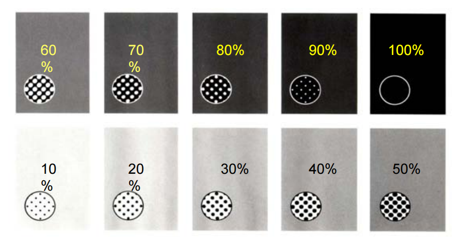
Dots are currently the most economical and effective method to express the gradation between black and white. Otherwise, hundreds of different grayscale inks must be pre-adjusted for printing. Cost, time and technology are all problems. Printing is basically still a zero and one concept.
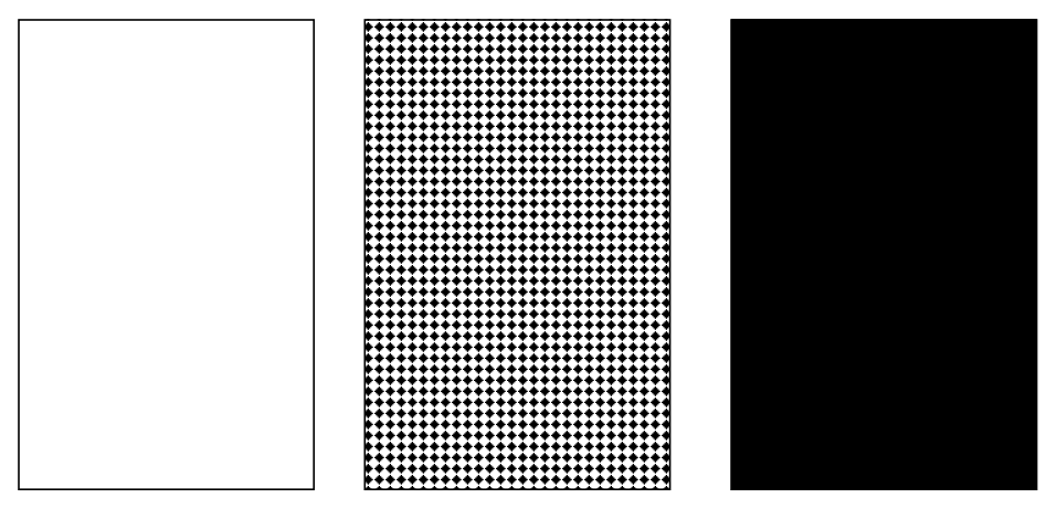
The density of dot distribution is different, so the printed colors will naturally be different.
Preflight
Preflight checks to confirm the correctness of the page description file; the job ticket processor accepts the page description file that will enter the process, and then performs initialization operations on the job ticket; the next step is to set up gap filling, image replacement, imposition, color separation, color management and output parameters, and the results are reflected in the job ticket.
DPI resolution
When it comes to resolution, we can't help but mention "vector graphics" and "bitmaps".
Vector graphics: graphics are not distorted when enlarged or reduced
Bitmap: DPI-the number of pixels contained in each inch
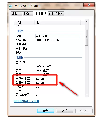
Generally, the graphics displayed on our screen are 72dpi or 96dpi, and the pictures in the printed files need to meet 300dpi+, and the graphics need to be embedded in the Ai software.
Color Mode
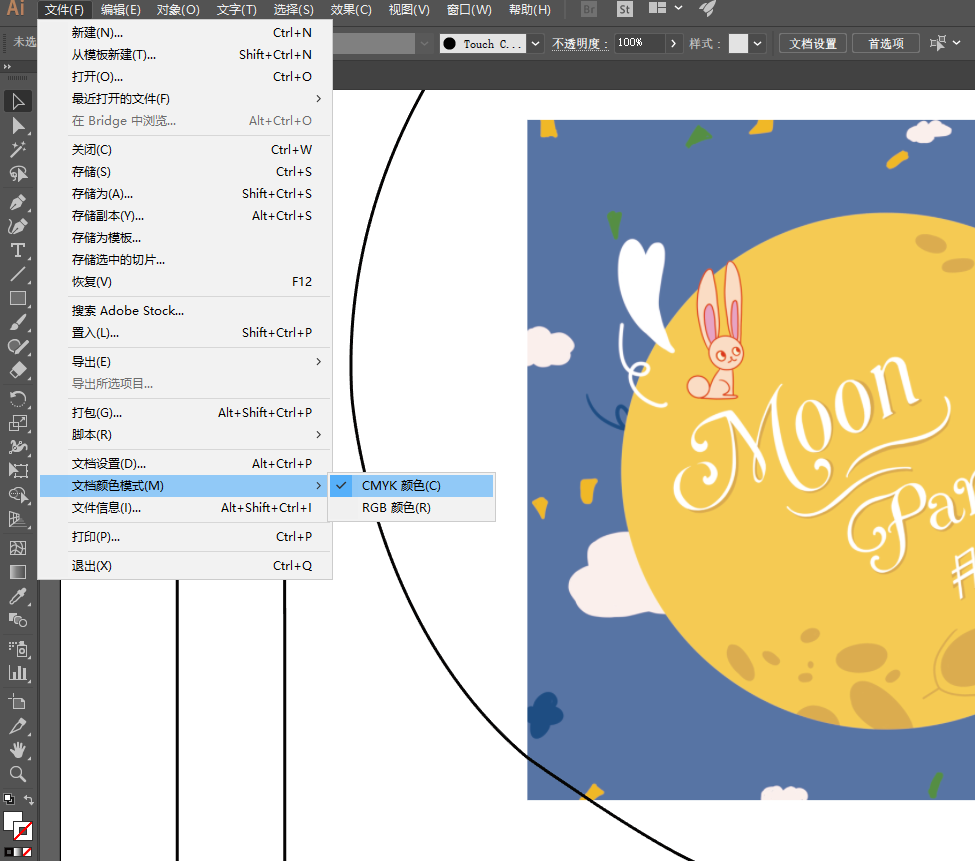
The printing file must be in CMYK mode. If it is not converted to CMYK, it is very likely that the design effect will not be printed, which is what we often call the color difference problem. CMYK colors are often darker than RGB colors.
Font size and lines
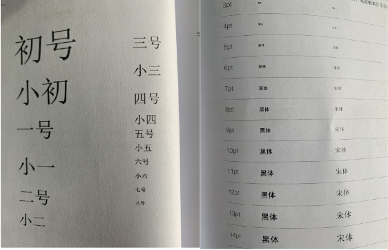
There are generally two ways to describe font size, namely the number system and the point system.
In the number system, the eight-point font is the smallest.
In the point system, 1 pound ≈ 0.35mm, and 6pt is the smallest font size that can be read normally. Therefore, the minimum font size for printing is generally set to 6pt
(The minimum font size for Hongze Packaging can be set to 4pt)
Printing line, 0.1pt minimum.
Font conversion/contouring
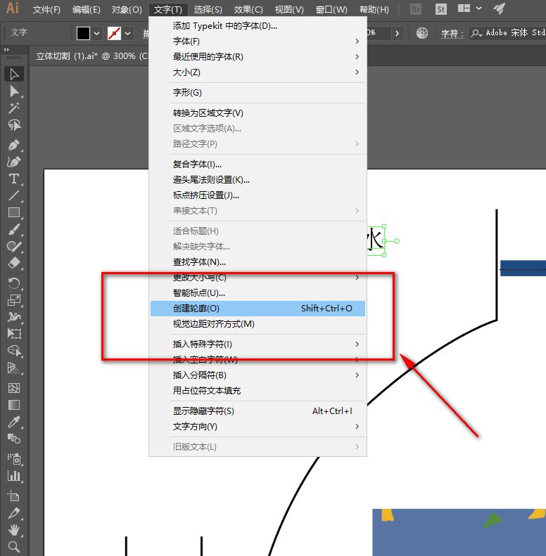
Generally, few printing houses can install all the Chinese and English fonts. If the printing house's computer does not have this font, the font will not be displayed normally. Therefore, the font must be converted to curve in the packaging design file.
Bleeding
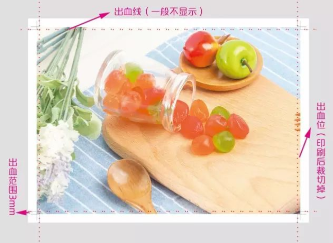
Bleeding refers to a pattern that increases the outer size of the product and adds some pattern extensions at the cutting position. It is specially used for each production process within its process tolerance to avoid white edges or cutting of the content of the finished product after cutting.
Overprinting
Also known as embossing, it means that one color is printed on top of another color, and the ink will be mixed after overprinting.
The most overprinted color is single black, and other colors are generally not overprinted.

Overprinting
Avoid mixing of inks. Usually when two objects overlap, the color printed later is hollowed out at the overlap so that the upper and lower inks do not mix.
Advantages: Good color reproduction
Disadvantages: May not overprint correctly, with white spots (paper color)
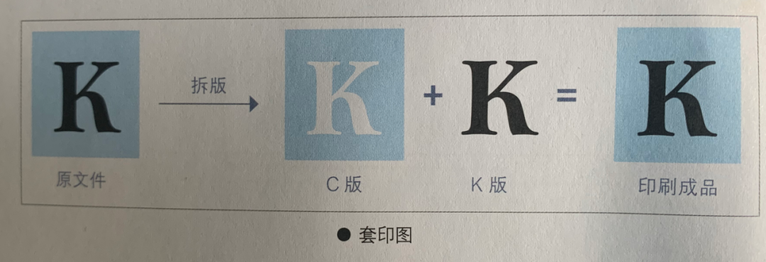
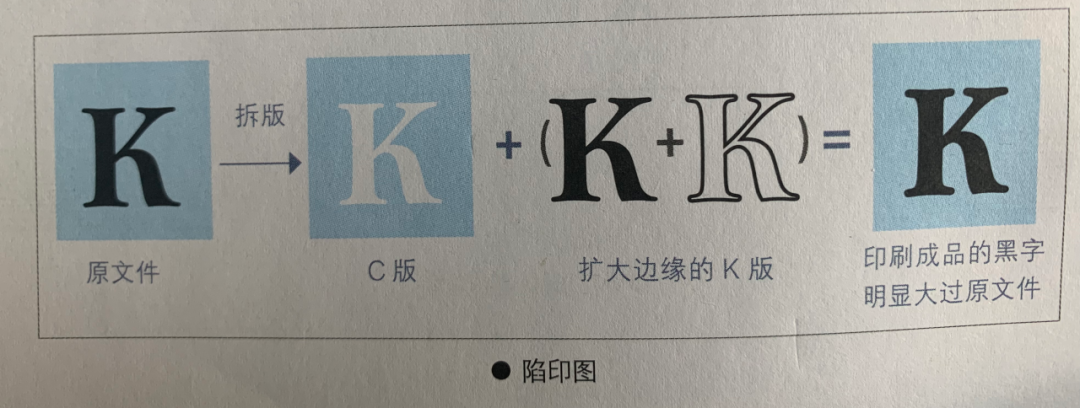
Trapping is a modified version of overprinting. By enlarging the edge of one object, the edge color will blend with the previous color. The overprinting will not show any white edges even if it is offset. The edge is generally enlarged by 0.1-0.2mm.
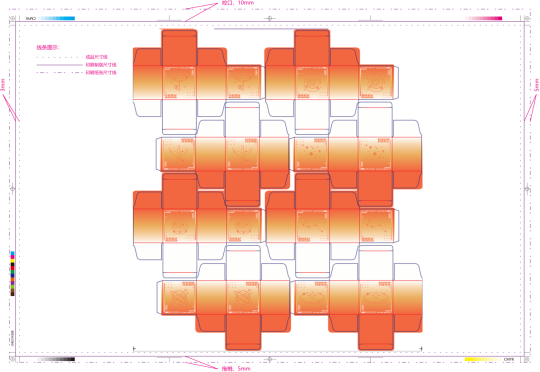
Imposing
Color difference
How does color difference occur?
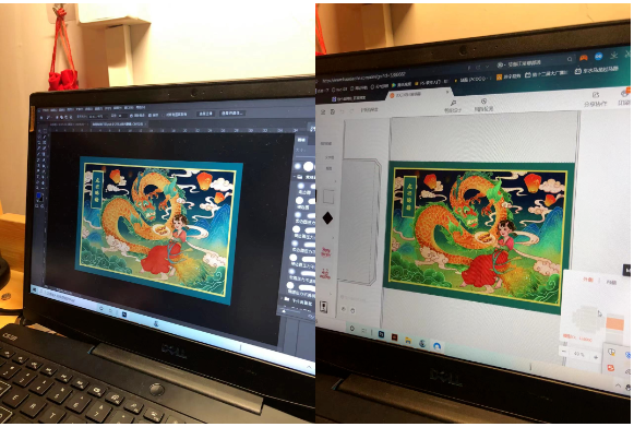
The color of printed products is affected by factors such as color mode, physical properties of substrates, machine process parameters, ink mixing master experience, light, etc. These factors are different, so corresponding color differences will occur.
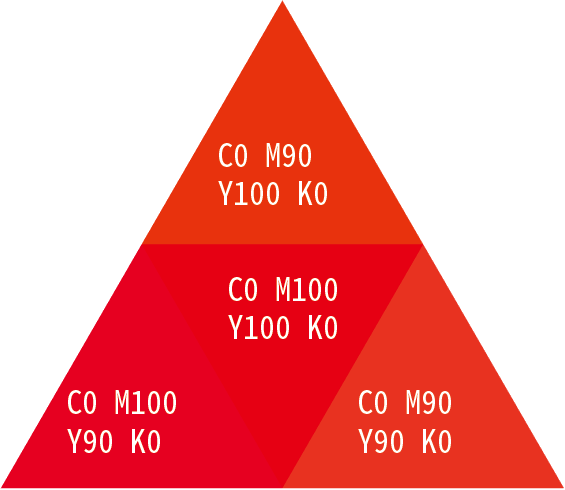
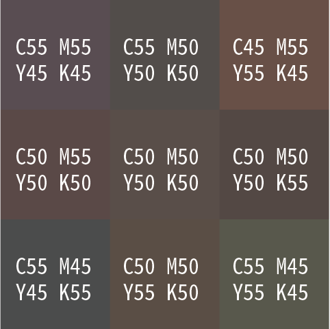
In printing, there are several colors that are often called dangerous colors. Printed products are prone to color deviation, so it is generally not recommended to use these colors for printing. It is better to use regular colors instead.
Let's take a look at the display of these "dangerous colors" within the 10% color range:
orange color
Navy blue
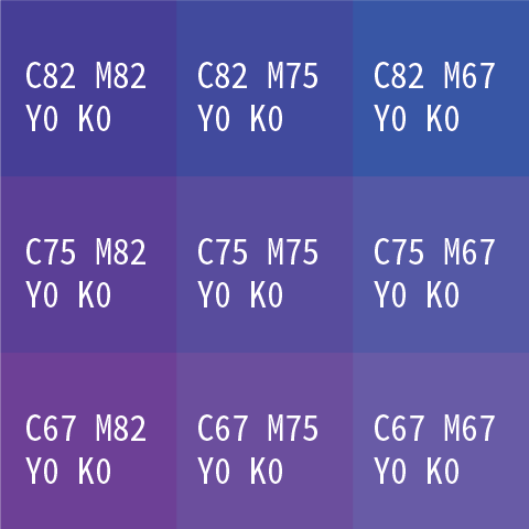
Purple
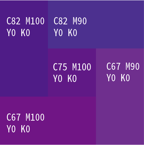
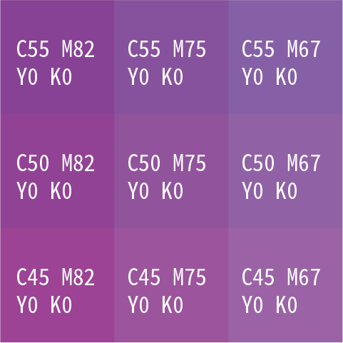
Brown
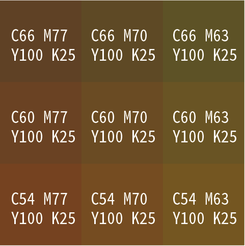
Four colors gray
Four colors black
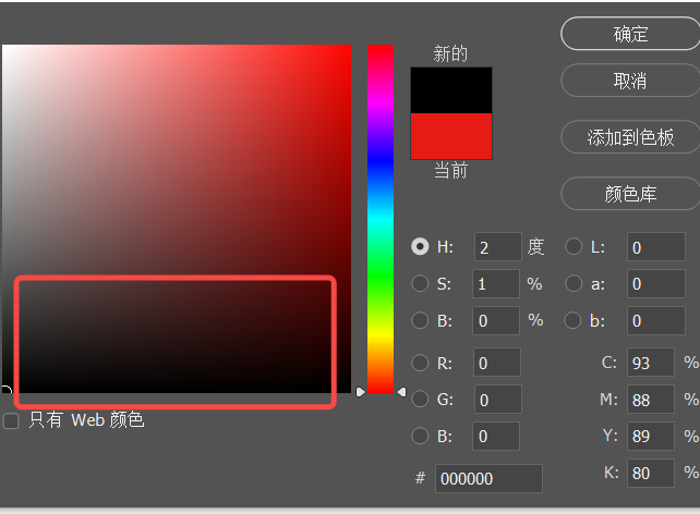
Single-color black C0M0Y0K100, it is very convenient to change the printing plate, only one plate needs to be changed.
Four-color black C100 M 100 Y100 K100, it is extremely inconvenient to change the plate, it is easy to have color cast or misregistration. Therefore, it is generally not recommended to use four-color black, and most printing plants do not print four-color black.
Post time: May-20-2024


